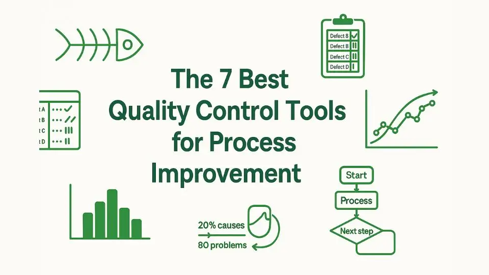
The 7 Best Quality Control Tools for Process Improvement
Sep 15,2025
Quality control is a critical component of any manufacturing or service industry. It ensures that products or services meet specified standards and satisfy customer expectations.
The key to achieving consistent, reliable quality lies in the systematic application of proven tools that help identify, analyse, and improve processes.
The seven basic quality control tools are among the most widely used and effective. This blog will explore these seven basic quality control tools and how they can be used to streamline processes, improve efficiency, and enhance product quality.
Cause-and-Effect Diagram
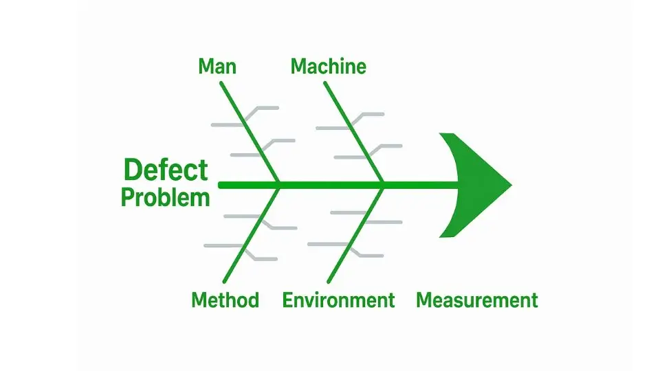
The Cause-and-Effect Diagram, also known as the Fishbone Diagram or Ishikawa Diagram, is one of the most powerful quality control tools for identifying the root causes of problems.
Its structure resembles a fish’s skeleton, with the “head” representing the problem or effect and the “bones” representing various potential causes.
The diagram is typically split into categories such as machinery, materials, methods, manpower, environment, and measurement.
By using this tool, teams can brainstorm all the possible factors contributing to a problem. It is particularly helpful in complex issues where multiple factors may be at play.
For example, if a company is experiencing a high number of defects in a product, the Fishbone Diagram can be used to trace back the cause of defects to issues related to the manufacturing process, supply chain, employee training, or machine maintenance.
This tool promotes a collaborative environment, ensuring that all potential causes are considered and properly analyzed. It encourages team members to think creatively and dive deep into the issue, thus leading to more thorough and accurate problem identification.
Check Sheets
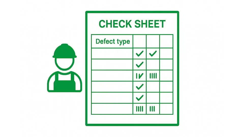
A Check Sheet is a simple yet effective tool for data collection and analysis. It is a structured form that allows team members to easily track and record occurrences of a specific issue over time. The form typically consists of a table or grid where data is recorded in real-time.
Check Sheets are extremely useful in situations where it’s important to track recurring problems, defects, or any event that requires frequency measurement.
For example, in a factory, a check sheet could be used to record the frequency of equipment failures, defective products, or customer complaints. Over time, this data can be analysed to identify patterns or trends.
The primary advantage of Check Sheets is that they provide a straightforward way to gather data systematically. This can lead to the identification of critical areas that require immediate attention or process changes.
Additionally, Check Sheets are incredibly easy to use and don’t require advanced statistical knowledge, making them suitable for employees at all levels.
Control Charts
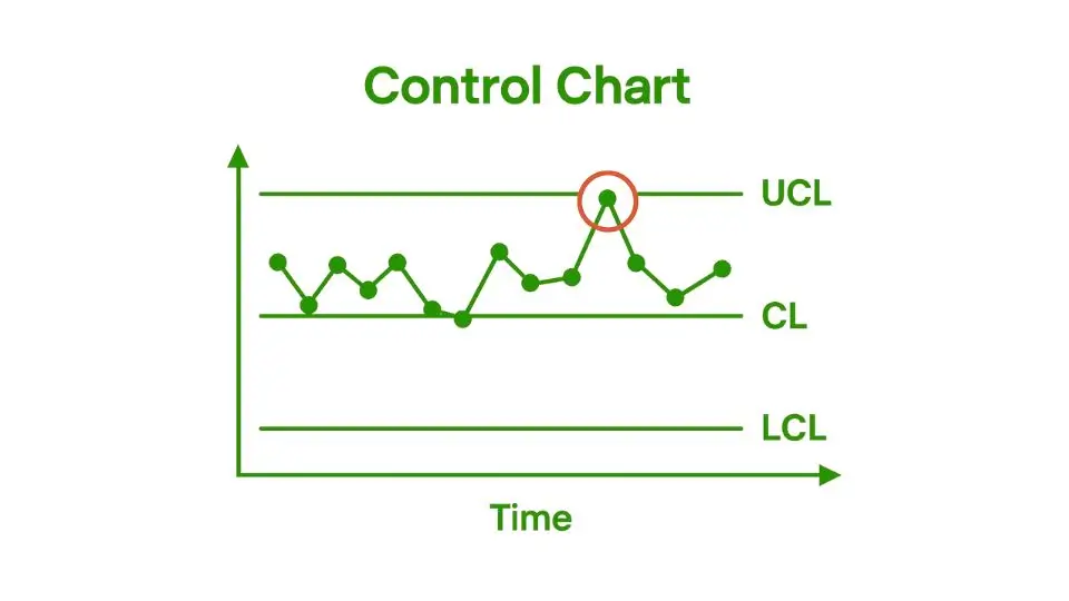
Control Charts are one of the most essential tools in statistical process control (SPC). These charts are used to monitor and analyze the performance of a process over time, helping to identify variations in the system.
A Control Chart plots data points against time, displaying upper and lower control limits. These limits define the acceptable range of variation for a given process.
Control Charts help differentiate between common cause variations (inherent in the process) and special cause variations (which arise from external or unusual factors).
By identifying the type of variation, organisations can take the appropriate actions to address the root cause of any issue.
For example, if a process is running within control limits but starts exhibiting a spike or unusual trend, it could signal a special cause variation requiring corrective action.
The use of Control Charts enables organizations to maintain stable and predictable processes. They provide valuable insights into process performance, and any data points falling outside of control limits act as a trigger for investigation or intervention.
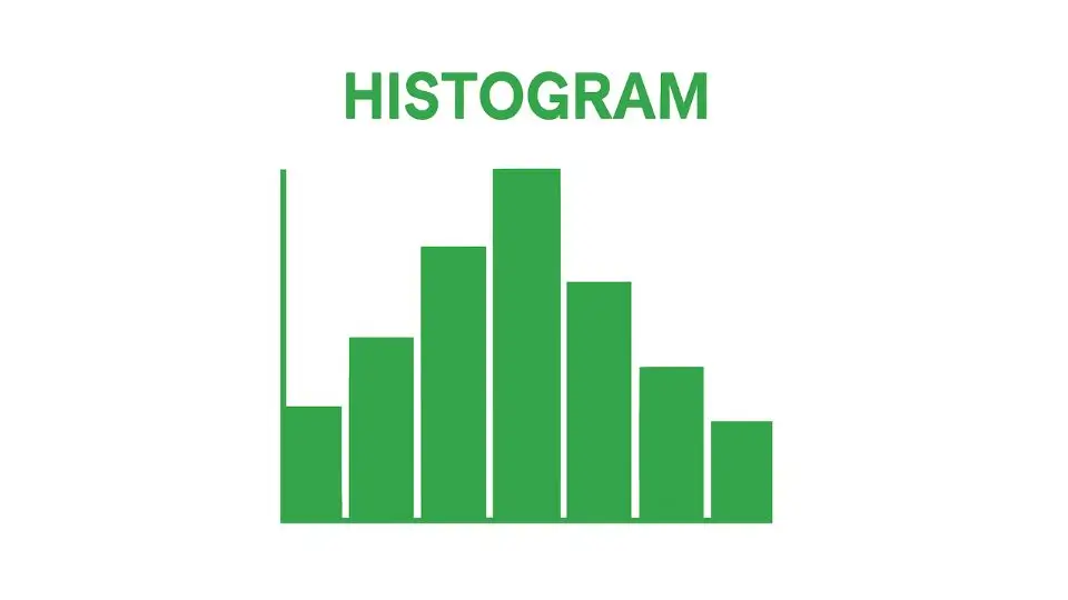
Histograms
A Histogram is a graphical tool used to represent the frequency distribution of data. It helps visualize the distribution of a set of data points by displaying the number of occurrences in predefined intervals or bins.
For instance, if you were analyzing the weight of products produced in a factory, a histogram would show how many products fall within certain weight ranges.
Histograms help organizations understand the underlying characteristics of their data, such as its central tendency (mean), variability (spread), and skewness (whether data is evenly distributed).
By providing a clear visual representation of data distribution, histograms help identify whether a process is functioning within expected parameters. They can also uncover defects or inconsistencies, such as a shift in production that might lead to out-of-spec products.
Histograms are particularly valuable when analyzing large sets of data, as they make it easier to detect patterns, trends, and outliers.
By understanding how data is distributed, organizations can make data-driven decisions about process improvements.
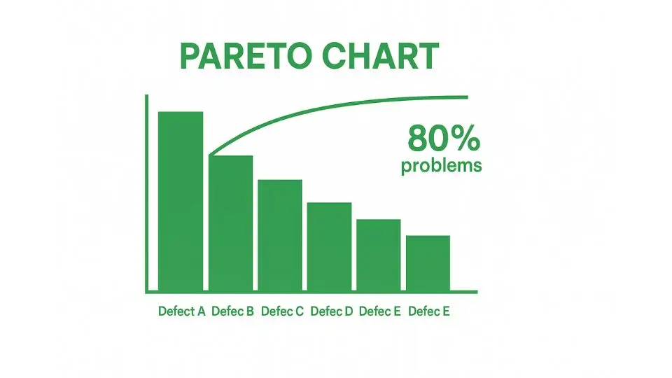
Pareto Charts
The Pareto Chart is based on the Pareto Principle, which asserts that roughly 80% of problems are caused by 20% of the factors.
The Pareto Chart visually combines a bar chart and a line graph to prioritize problems based on their frequency or impact. The bars represent the frequency of occurrences, while the line graph shows the cumulative total.
The Pareto Chart is an excellent tool for identifying the most critical issues that need immediate attention. It allows organizations to focus their efforts on solving the most pressing problems, leading to significant improvements in the overall process.
For example, a company might discover through a Pareto Chart that a small number of product defects are causing the majority of customer complaints. By addressing these few root causes, the company can make the most impactful improvements to its product quality.
Using the Pareto Chart, teams can easily prioritize their quality improvement efforts, ensuring that resources are allocated to the issues that will provide the highest return on investment.
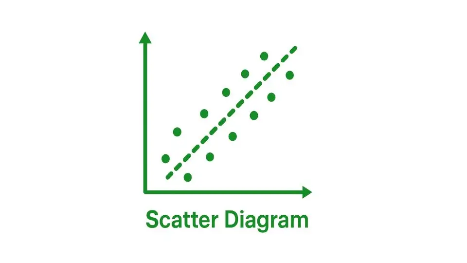
Scatter Diagrams
A Scatter Diagram is a graphical tool used to explore the relationship between two variables. Data points are plotted on a Cartesian plane, with one variable on the x-axis and the other on the y-axis. The pattern formed by the data points can reveal if there is a correlation between the variables.
For instance, a scatter diagram might be used to examine the relationship between the speed of a machine and the number of defects in a product.
If the points form a clear upward or downward trend, this suggests a correlation, which can lead to further investigation and improvement.
Scatter Diagrams are valuable for identifying potential relationships between factors that might not be immediately obvious.
By visualizing these relationships, organizations can determine which variables are most influential in determining process outcomes, leading to more targeted improvements.
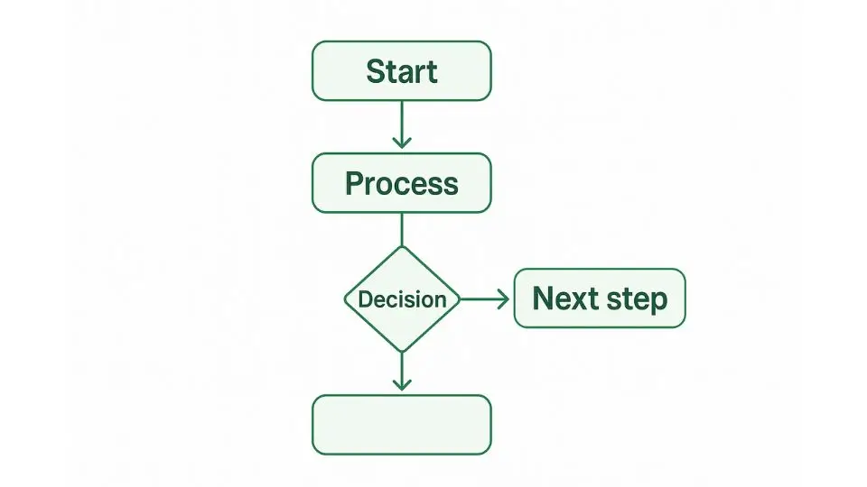
Flowcharts
A Flowchart is a diagram that visually represents the steps in a process. It provides a step-by-step guide that helps team members understand how the process works, where bottlenecks might occur, and where improvements can be made.
Flowcharts are particularly useful for mapping out workflows, standard operating procedures (SOPs), or any sequence of operations that need to be optimized.
Flowcharts are highly versatile and can be used to analyze, document, and improve both simple and complex processes.
By visualizing the entire process, teams can identify unnecessary steps, redundant activities, or areas where errors are likely to occur. This can help streamline workflows, reduce waste, and improve overall process efficiency.
A well-designed flowchart serves as both a communication tool and a reference guide for process standardization. It ensures that every team member follows the same procedure, contributing to consistency and quality.
Integrating the 7 Quality Control Tools for Maximum Impact
While each of these quality control tools is valuable on its own, the real power lies in their integration. By using multiple tools together, organizations can gain a comprehensive understanding of their processes and identify the best areas for improvement.
For example, a team might use a Cause-and-Effect Diagram to identify potential root causes of an issue, then collect data using Check Sheets and analyze it with Control Charts and Histograms.
After prioritizing issues using a Pareto Chart, they can explore relationships between variables with a Scatter Diagram and map the process with a Flowchart to identify areas for improvement.
This holistic approach ensures that organizations can make data-driven decisions, prioritize their efforts, and implement effective solutions for continuous improvement.
Conclusion
These seven essential quality control tools are essential components of any organization’s quality management system.
Whether you’re dealing with manufacturing defects, process inefficiencies, or customer complaints, these tools lay the foundation for effective problem resolution and process optimization.
Integrating these tools into daily operations fosters a culture of continuous improvement, where data-driven decision-making leads to sustainable improvement and long-term success.
--- END ---
Products
Get A Free Quote
Related Blogs

 December 31,2025
QCC SAMPLE REPORT
For sample reports or custom checklists, please contact us – we're here to assist you.